NovEduca

Audit Report for Learning Hub

Developed for Global Development Organization (Client Identity Undisclosed)
Discover how we analyzed four asynchronous, certificate-based courses to identify best practices and recommend improvements for engagement, interactivity, and user experience.
Cover for the case study titled: "Audit Report for Learning Hub". Features a lime background with darker shades of this color. The design contains three circular images: The first image shows a student happily taking notes in his tablet. The second image shows a group of students sitting in a round table while discussing a certain topic. The last image shows a student doing a course in her laptop while smiling.
Circular diagram titled 'Our Approach' illustrates the relationship between three key elements: 'User Experience,' 'Usability,' 'Instructional Design,' and 'Multimedia Elements.' 'User Experience' is at the top center, connected by arrows to 'Multimedia Elements' (purple icon with a document), 'Usability' (blue icon with a hand pointer), and 'Instructional Design' (orange icon with a document). The diagram visually represents an interconnected approach to design and usability.

What We Did

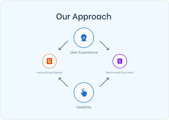
We conducted a comprehensive review of four randomly selected self-paced courses, focusing on instructional design, multimedia elements, and overall user experience. We also audited three additional courses for usability issues, cataloging each issue and its potential impact.

Screenshot of a document section titled '2.1.a Images and Graphics' with a 'High' impact warning marked by a red dot. The document critiques a graphic for poor clarity and non-compliance with WCAG 2.2 accessibility standards. The graphic itself, which is inside a red oval, contains multiple purple text boxes with navigation instructions for a digital interface. The document suggests alternative approaches, such as a video guide, to improve accessibility and usability.

How We Did It

We systematically evaluated the courses’ structure, resources, and interactive components, documenting strengths and gaps. This process included assessing alignment with the organization’s mission, cataloging all learning materials, and highlighting areas where stronger interactivity, peer engagement, and personalized feedback could enhance outcomes. We also identified user interface and user experience concerns—such as unclear instructions, content hierarchy issues, and visual design inconsistencies—and prioritized recommendations for immediate and longer-term improvements.

Timeline titled 'Recommendations for Course #' displaying four tasks with different completion statuses. Two tasks—'Add peer collaboration instances' and 'Introduce PBL integrative activity' (both dated February 24)—are marked as 'Complete' with green checkmarks. Two other tasks—'Create rubric' and 'Refine automated feedback' (both dated March 3)—are marked as 'Pending' with yellow ellipses. A vertical timeline visually connects these tasks, indicating progression.

What We Accomplished

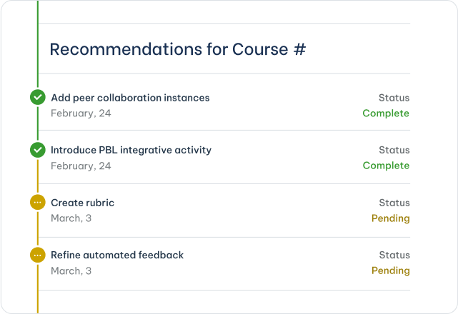
Our analysis yielded a clear roadmap of enhancements to align course design with best practices in online learning and user experience. Recommendations ranged from introducing project-based learning and peer collaboration to refining feedback mechanisms and ensuring consistent visual design. The result: actionable steps to transform existing offerings into a more cohesive, accessible, and engaging learning experience, ultimately supporting the academy’s mission of accelerating solutions through inclusive, high-quality online education.

Share

Let’s Grow Together

Connect with us to learn more about what we can do for you.

Contact Us

A modern, minimalistic digital illustration showing a diverse group of learners (one using a wheelchair, one using sign language, others with laptops/tablets) in a warm, inclusive setting. The color palette includes teal, white, and dark gray. It incorporates subtle tech and circuit lines in the background to convey digital learning. Large, bold text overlay reads ‘Leaving No Learners Behind By Design.’
ImpactTransformation

Leaving No Learner Behind By Design

Illustration of two teachers engaged in a discussion while working on a laptop in a technological environment.
DesignImpactTransformation

Virtual Courses: The Real Cost (and ROI) of Building Great eLearning

Assignment Templates for Higher Education and for Professional Development (Comparison Table)

Templates for crafting effective, adult-learner-focused assignments.

Assignment Templates for Higher Education and for Professional Development (Comparison Table)

Templates for crafting effective, adult-learner-focused assignments.